Getting to grips with Sketch as a developer
When developing a software product you’re going to inevitably need visual assets/graphics and an idea on how to lay them out so as a developer I feel its important to have an understanding of how to generate simple assets, manipulate them and export them effectively.
When working with clients we’ve had designs provided in all kinds of formats — Powerpoint, InDesign, Word and more — but at Add Jam we’re massive fans of the brilliant Sketch App by Bohemian Coding and as much as possible stick to using that for our design work.
Getting started
Going from the top, you’re going to need to buy Sketch. The folks at Bohemian Coding made two big announcements last year, firstly they pulled Sketch from the Mac App Store (so it’s only available as a direct purchase) and secondly they’re moving to an annual subscription of $99 a year.
Versus the alternative (looking at you Creative Cloud) it’s still extremely good value but for the purposes of getting your hands dirty and giving some of the things in this post a go you can use the Free Trial.
Before jumping in a quick glossary of some terms:
- Artboard — a container we place design elements into. Often we’re doing mockups and our Artboards are representing the display screen of our end product like an iPhone 6 at 375px x 677px. But we might also use an Artboard for a logo or icon.
- Page — when the representation of our product grows across many Artboards it becomes easier to split it out into pages (and it makes Sketch run smoother not to have everything in the one Artboard).
- Symbol — just like when we code we want to extract often used elements into a reuseable single element. Symbols allow us to share styles and attributes across many Artboards. Sketch actually comes preloaded with symbols for iOS and Material Design.
- Elements — these are things that come together to make our design. This can be bitmaps, vectors or text elements made in Sketch. These are layered so have an order front to back (like a Z-index).
- Groups — as we build up our elements we will want to group them together in logically named groups. For example a ‘Send Button’ will likely have a text element and a shape.
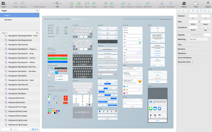
So we know some of the lingo, let’s fire Sketch up. Open a new project and you’re presented with:

Let’s get comfy. The left sidebar is where we switch between pages and our Artboards. We’ll also see our layers and elements here. The right sidebar is kind of like the iWorks style format bar, we can adjust attributes for elements such as size, colour, border, position, alignment etc.
Taking some shortcuts
As developers we like to speed up or workflows with shortcuts. Sketch has us covered. Some often used shortcuts are:
- A — create a new Artboard. Drag it out on the page or select a predefined Artboard size from the right sidebar
- R — rectangle shape, press R and drag a rectangle onto your Artboard
- L — add a line, press L, click and drag a line. Boom.
- O — oval, you’ll never guess but press O and drag a circle element onto the Artboard
- T — add a text element, click where you want it and enter the text
- ⌘ + G — Group elements, select them on the lefthand sidebar and ⌘ + G to create a group of your elements (useful for keeping your layers readable)
- ⌘ + R — rename a layer or group. Be a good guy and use meaningful layer names
- ⌘ + F — filter layers. Using meaningful names will make it easier to find layers on your Artboard
Dive in
Personally I like to learn by example so let’s create a mock up for an iOS cinema app movie listing.
Open a new project from an ‘iOS UI Design’ template and we’ll have a good starting point for an iOS mockup as we’ll be given a host of symbols for various iOS UI elements from the nav bar to the keyboard.
We’ll start on a fresh page by pressing the plus on the pages area of the left sidebar. Now we want to create an iPhone sized Artboard, press A and on the right sidebar select iPhone 6 (375px x 677px).
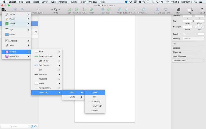
So far we have a our Sketch file created from an iOS template, a host of symbols and an iPhone 6 sized Artboard. Next step add some elements to our design. Starting at the top of our design we need an iOS status bar, this is a symbol given to us in our iOS template. We can add it by clicking the inset menu on the top left > Symbol > Status Bar > Black > select a status bar symbol.
The symbol will be added to the Artboard and we can see it on the left sidemenu. We now need to position the status bar to the top. Select the element by clicking on it either on the Artboard or on the left sidebar, it’s now active (with an outline and resize boxes on the element itself and in the left sidebar it is highlighted blue). We can now drag the element about our Artboard to place it or on the right sidebar we can set the X and Y position attributes both to 0.
Easy.
Next step I want an image which sits below the status bar. I’m going to drag a bitmap image on top my Artboard from Finder and again position it. In this case I again want the X and Y to be 0. I also want it to be the full width of my design so I set the width to 375px. Of note here is the padlock between the width and height attributes on the right side bar, with the padlock icon ‘closed’ resizing the image will maintain the aspect ratio i.e. you change the width the height will change at the same ratio. If you click the padlock icon it is now open, this means you can change the width and height values independently.

With the image positioned correctly and at the right size I want to make sure it’s in the right ‘order’ for the screen. On the left sidebar the elements ordered top to bottom reflect the order they are place on the screen we want our status bar to be on the top so click and drag it in the sidebar to be on the top or while selected us the ‘Forward’ and ‘Backward’ icons on the top bar to change the order.
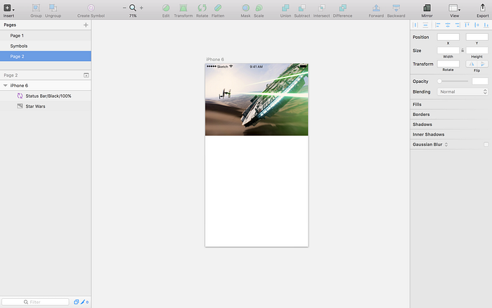
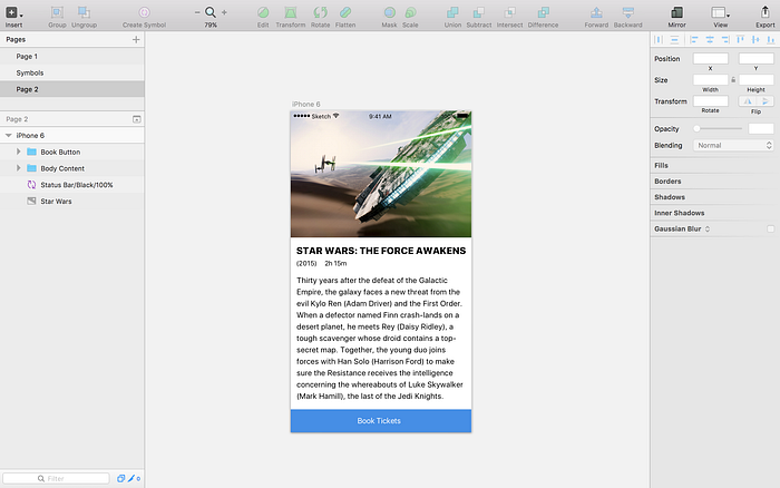
Our mock up should look something like the above. Moving down the design the next elements I want to add are to display the movie title, run time, year of release and a synopsis. These are all text elements so using the T shortcut to add the text elements in we can position them and fill in placeholder content. On each text element we can set attributes from the right sidebar such as font, font size, font weight, colour and alignment.
All these text elements logically make sense to be group together. So using ⌘ + clicking on each element on the left sidebar we can can select multiple elements and by pressing ⌘ + G we can create a group. Then using ⌘ + R rename the group to a meaningful name like body content.
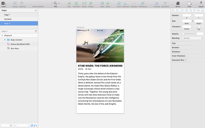
The app design, while basic, is coming together. Now to add a book ticket button to the page. Our button will be made up from a rectangle (R) and a text element (T). Position them as we wish and group them together, again giving them a meaningful name.
Shapes like the rectangle have similar attributes to text displayed on the right sidebar. By default shapes will be drawn with a border but for our design we don’t want one so untoggle the border (a shortcut for this is B).
Our design should now look something like this.
Taking the design into your code
Our design is ready we now need to transition this to our code. Regardless of how we implement the look of our mockup Sketch has some handy features that make life easier for developers.
Firstly for UI elements that require graphic assets Sketch allows us to create export maps for various sizes we require. For the iOS app example we’ve been working with we’ve designed at @1x. The Artboard is 375px x 677px but an iPhone 6 with its retina display has a resolution of twice that and Plus sized phones require assets at 3x that density. With Sketch its super simple to create slices for assets with rules for all our larger sizes.

With a group or element selected on the bottom right we can ‘Make Exportable’. Once we have a ‘slice’ we can export at different sizes, give that size a prefix or suffix (ideal for iOS @2x and @3x) and the file format.
It’s important to note that obviously not all design elements should be graphic assets. The button in the above example is easy to implement in code but for that we need to know sizes and positioning. With Sketch we have handy tools that help developers implement a layout. Pressing ‘alt’ and hovering over elements gives spacing and sizing information in relation to other elements in the design.
Is there a better way to get this stuff?
Well the short answer is yes, tools like InVision and Zeplin make it so easy to work as a team. Designers can import their designs, developers can get a styleguide, assets and sizes (and actually code snippets too) and other stakeholders can add comments and review the design easily.
I highly recommend checking those two tools out but that being said I still think its important for us developers to have an understanding of how to do at least the basics in Sketch and similar tools.
Add Jam are creating useful software products in the heart of Glasgow. If you’re ever nearby, feel free to pop into our office for a cup of coffee or a game of pool. If you’re looking for a team to build your product, get in touch.

